


1. http://www.samuelljackson.com//
I like this website, not only because it’s Samuel L. Jackson, but also because the grayscale and red theme works almost every time it’s used. And the layout follows most of the general guidelines, like text in the right hand column links are easily accessible, the content of the site is good and the graphics and font compliment it all well.

2. http://tutorialblog.org/
I also like this website because of the subtle colour scheme used. The layout is aesthetically pleasing, the banner at the top with links to twitter and other social networking sites. Then any other links below it as well as the search bar and below that are recent posts. In the right hand column are sponsors, categories and other links.
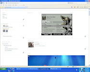
Totally S****y

This website makes me cry, honestly. As if the content wasn’t bad enough to begin with the background and random crap splattered all over the page, was thoroughly annoying and gave me a migraine in the time it took me to Ctrl + V the URL then close the page. Other than that if you can manage to find the links on the page they don’t seemed to be placed in a very strategic way.


No comments:
Post a Comment