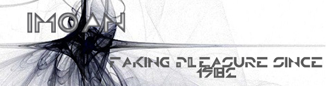
This is the logo for one of the webpages for my website. I find that the monochromatic themes or at least a complimentary theme, one that includes greyscale obviously. The font, and all the labels, are ones that appeal to me.
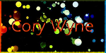
I used a basic sort of symmetry, coincidentally because my name consists of two 4 letter words. I used a background that had Green, Blue, Red and Yellow, 3 of those are primary colours.


No comments:
Post a Comment