Playlist


Get a playlist! Standalone player Get Ringtones

Banner

Banner

Friday, November 13, 2009

Website


I liked the dark colour scheme however i would have enjoyed some more macabre colours like red and more of a diverse grayscale.  I also would have enjoyed to have a right navigation bar, had i learned how to put tables next to each other, or learned how to make individual cells in table transparent.  However overall i think the website went fairly well. 

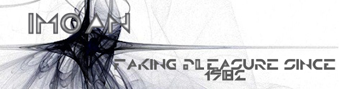
In a website that was mine i would have had obviously more inspiration and would have put more work or thought into the actual content of it.  however the content in this case was not an overly large deal, and was in fact only there to show that i knew how to format the font.  All in all it could have been better in my opinion, but seems to have sufficed as far as criteria goes.

No comments:

Post a Comment

Logos