Playlist


About Me
Banner
Friday, January 22, 2010
Photoshop Assignment - CD Case Front
Wednesday, January 6, 2010
Photoshop Assignment - Text


Not only is the simple word "moist" suggestive in the right company, but the effects are nice too, long and drawn out and repetitive but nice nevertheless.
Photoshop Assignment - Images


This one I chose because most people at one point had at least heard of everyones favourite Italian Plumber, and his A#$hole cousin Wario.
Thursday, November 19, 2009
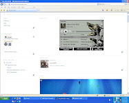
Website Thing

This is the logo for one of the webpages for my website. I find that the monochromatic themes or at least a complimentary theme, one that includes greyscale obviously. The font, and all the labels, are ones that appeal to me.
Friday, November 13, 2009
Website

In a website that was mine i would have had obviously more inspiration and would have put more work or thought into the actual content of it. however the content in this case was not an overly large deal, and was in fact only there to show that i knew how to format the font. All in all it could have been better in my opinion, but seems to have sufficed as far as criteria goes.
Monday, November 2, 2009


Tuesday, October 27, 2009
October 27th 2009
Today we worked on our webpages, including the banners, framework of the website itself.
Websites
Well Designed

1. http://www.samuelljackson.com//
I like this website, not only because it’s Samuel L. Jackson, but also because the grayscale and red theme works almost every time it’s used. And the layout follows most of the general guidelines, like text in the right hand column links are easily accessible, the content of the site is good and the graphics and font compliment it all well.

2. http://tutorialblog.org/
I also like this website because of the subtle colour scheme used. The layout is aesthetically pleasing, the banner at the top with links to twitter and other social networking sites. Then any other links below it as well as the search bar and below that are recent posts. In the right hand column are sponsors, categories and other links.
Totally S****y

3. http://www.dokimos.org/ajff/
This website makes me cry, honestly. As if the content wasn’t bad enough to begin with the background and random crap splattered all over the page, was thoroughly annoying and gave me a migraine in the time it took me to Ctrl + V the URL then close the page. Other than that if you can manage to find the links on the page they don’t seemed to be placed in a very strategic way.

1. http://www.samuelljackson.com//
I like this website, not only because it’s Samuel L. Jackson, but also because the grayscale and red theme works almost every time it’s used. And the layout follows most of the general guidelines, like text in the right hand column links are easily accessible, the content of the site is good and the graphics and font compliment it all well.

2. http://tutorialblog.org/
I also like this website because of the subtle colour scheme used. The layout is aesthetically pleasing, the banner at the top with links to twitter and other social networking sites. Then any other links below it as well as the search bar and below that are recent posts. In the right hand column are sponsors, categories and other links.
Totally S****y

This website makes me cry, honestly. As if the content wasn’t bad enough to begin with the background and random crap splattered all over the page, was thoroughly annoying and gave me a migraine in the time it took me to Ctrl + V the URL then close the page. Other than that if you can manage to find the links on the page they don’t seemed to be placed in a very strategic way.
Friday, October 16, 2009
Photos
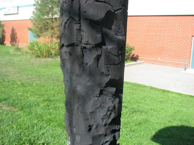
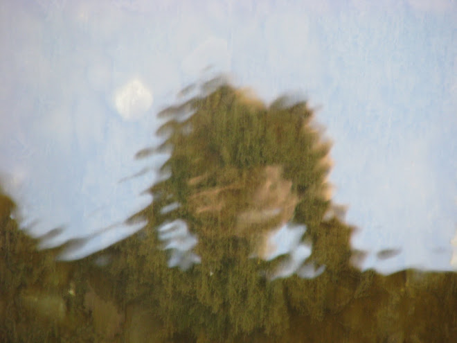
Today i finished picking my 110 photos for the tourism website i will likely begin next day, however i also had to choose my two favourite photos out of those 110...no easy task but considering what an urbanite i am its likely ill pick some photos from the beijing section, idk check them out below or beside...or something. These two particularily appeal to me because of the offset of grayscale, the muggy, wet, foggy and almost depressing background, with the bright colour of tailights and assorted mundane colours. Or at least the one on the right...however i was just told that the one on the right seems to be much more energetic...which i can appreciate, but i just don't want to.


Wednesday, October 7, 2009
Logo
I really hated all that awful music, except for mine of course. everything else was fine, i didn't play halo at all...and i started working on a new logo, or different sized logo...
Subscribe to:
Comments (Atom)